Aggregate Expenditure and Utilization
The purpose of the Health Endeavors aggregate expenditure and utilization is to provide a specialized charting report with a drill down to the division, TIN, subgroup and NPI level based on the Medicare aggregate quarterly reports. The Medicare quarterly report only provides numbers at the ACO level. By utilizing this report, you are able to refine data down to more specific organizational levels.
In this user guide, you will learn how to use the Aggregate Expenditure and Utilization report.In this user guide, you will learn how to use the Aggregate Expenditure and Utilization report.
Step-by-Step Guides
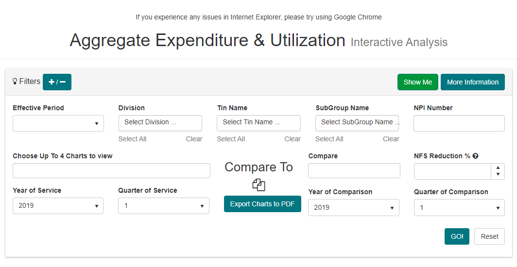
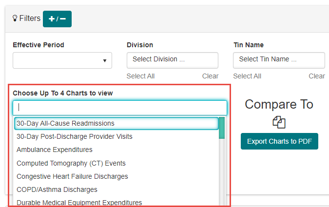
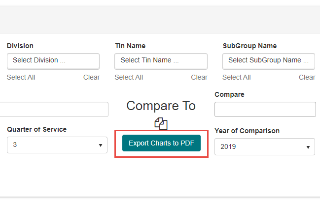
- The Aggregate Expenditure & Utilization report has a left and right side to its Filters section. On the left side, you may select up to four separate charts that show aspects of patient data within your organization. On the right side, you may compare these charts against one of three separate averages received from quarterly Medicare reports. The purpose of this is to view your organization’s expenditure and utilization data, and then compare this against averages to gauge your organization’s efficient use of time and resources.
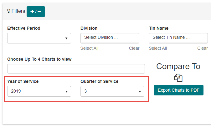
Although the filters on the left will automatically choose the current Year of Service and Quarter of Service, you may use the drop down menus for these selections to change to a previous year and/or quarter.
Once a chart is selected from the left, the rest of the page will populate with relevant data. However, it is recommended to configure the left side of the Filters section before moving on.
Under the Compare dropdown, you may select one or more of the following three averages:
National FFS Avg – The National Fee For Service Average represents mean expenditures, including non-claims based payments such as care management fees, calculated over the national FFS report period for all Medicare FFS beneficiaries meeting certain criteria.
MSSP ACO Avg – The Medicare Shared Savings Program ACO Average represents an un-weighted median of values for all currently active MSSP ACOs in Track 1 and 2 at the time the report was run.
AXXXX – This is a placeholder for your ACO’s abbreviation. This compares against the average spend across the entire ACO to which your organization is a part of.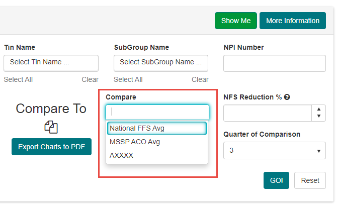
Using the NFS (National Fee for Service) Reduction, you may enter a percentage that you wish all areas to be below the average national spend. This serves as an additional benchmark to gauge required expenditure levels to meet savings goals.
As with the identically named filters on the left, Year of Comparison and Quarter of Comparison will default to the current time period, but can be changed using the dropdown menus.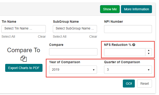
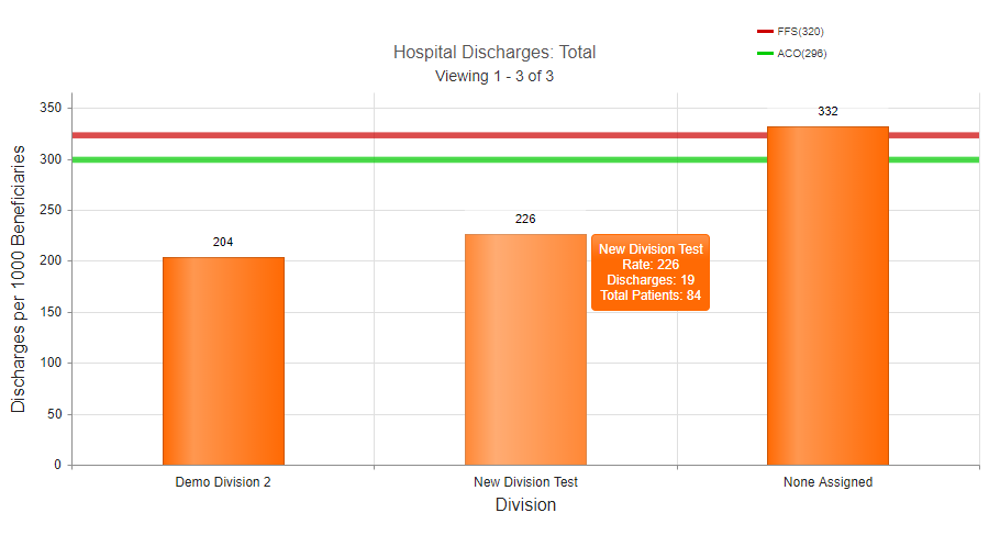
Just below the filters, the selected charts generate as bar graphs. These charts start at the highest level overview available, such as across the ACO or all practices under a division. Using the mouse wheel, you may scroll to drill down to more specific groups, all the way down to and including a specific practice. The basis for the graph depends on the type of chart(s) selected. The vertical scale indicates sheer numbers; in this example, readmissions for every 1000 discharges. If any of the three Comparison options were selected, a colored line appears indicating where the average for that selection stands in comparison to the numbers presented in the chart.
Note: If you would like to view exact information for a specific group in the chart, move your mouse cursor over the orange bar to pop up this information.
If you would like to save a chart, click the Export Charts to PDF button in the middle of the Filters section. This will create a PDF of the chart that may be saved or printed as required.
At the bottom of the page, the Patient List section displays all patients accessible by your user role and organization. On the far left, the columns list basic patient information, including HICN, MBI, First Name, Last Name, Date of Birth, and Medical Record Number. Further to the right, the patient list also displays a patient’s attribution information. This includes the Division, TIN, Sub TIN, and Assigned NPI for the patient’s attributed provider.
Note: As you change levels in the Chart view, the Patient List automatically updates to fit those levels. For example, if you moved from divisions down to NPI level, only patients belonging to the specific NPI would remain on this list.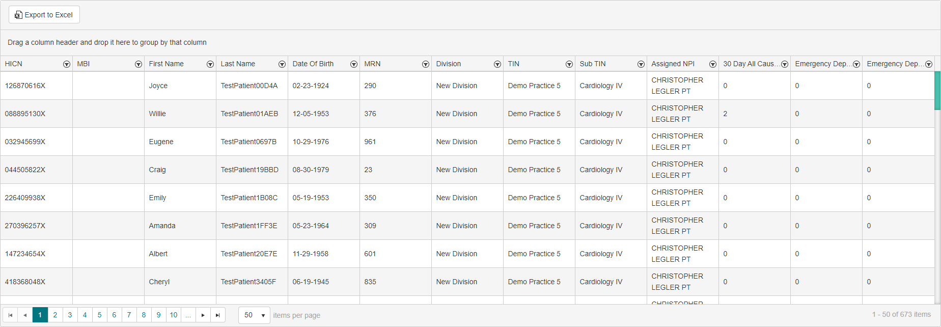
Each of the columns has a built-in filter for further narrowing the patient list. The results in the patient list can be filtered so that only information from that column that Is equal to, Is not equal to, Starts with, Contains, Does not contain, or Ends with text entered remains on display.
In this example, patients with a HICN that contains 123 would remain in the patient list.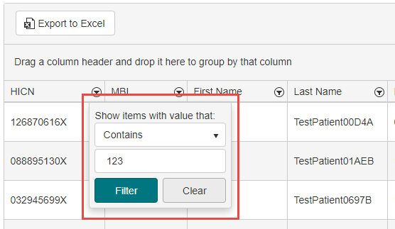
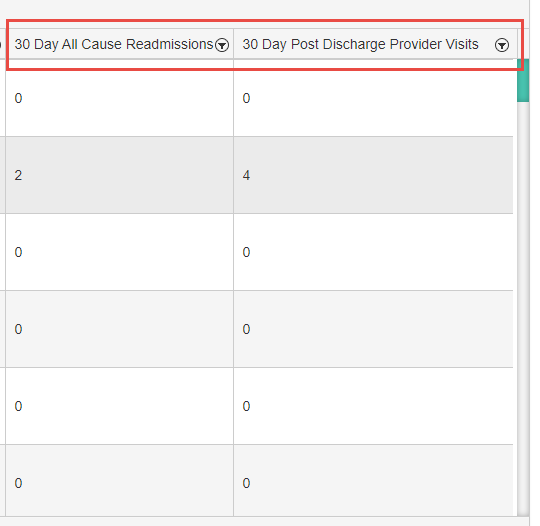
The far right side of the patient list populates columns based on selected charts in the Filters section. By viewing these columns, you can see at a glance whether or not specific patients had a claim or event related to the selected chart, and how many such instances exist in their data.
Did you know:
- The Aggregate Expenditure & Utilization has three primary sections: Filters, Charts, and the Patient List
- You can select up to four Charts in the Filters section to display bar graphs with relevant data
- You may also select one or more of three separate averages to compare these charts against: National FFS Avg, MSSP ACO Avg, and your ACO average
- Charts may be exported to PDF for easy saving and printing
- The Patient List displays basic patient profile data, as well as columns related to the selected Charts from the Filters section
- If you would like to review a list of helpful tips for this report, click the More Information button in the upper right.